Resources for this post:
Education Insights can be presented in 3 different formats: Descriptive, Predictive and Prescriptive. To thoroughly understand your ATAR data is a descriptive task, one which can be made a lot simpler with tools like Power BI.
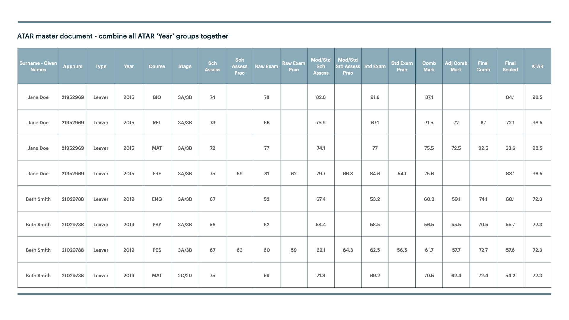
All secondary schools have access to their ATAR performance data from TISC. It looks like the table below. The PowerBI dashboard only uses the data from within this report. The result is a very detailed overview of what has happened, but also some good insights into, what can be done for better performance in the future.
You can access your schools data from TISC. Put it into PowerBI to gain additional insights.
In the referenced link you will find a 5-page report that looks in detail at:
Page 1 - Atar progress
Review your past student count and median score. You can filter the range to see those students who scored above certain score (eg 90).Page 2 - Centrality & Dispersion
Discover the median and interquartile distribution and also see the frequency of a particular range. Use the filter to limit the range to see how outliers may have impacted the median.Page 3 - Grade Distribution
Which range in the grades is the most popular. Overlay the good years against the bad to see how things could be improved.Page 4 - Course Moderation
A moderated score is derived depending on the generosity of the school assessments and the outcome of the exam. This makes all schools comparable. But which way is your school moderated and how can this be rectified to prepare your students for the final exam?Page 5 - Course Scaling
All years and courses often have very different scaling directions at different points. By applying a simple linear regression we can see what the average scaling direction has been across the years and where the ‘sweet spot’ (scaled up or down) occurs.
The dashboard obviously contains dummy data. I encourage you to explore the different years and the different courses.
What insights could your data provide?
How could your school adjust practice to enhance student outcomes?


