iWork tip

English and Digital Literacy

iSupport_qwerty.jpg

Free Teaching Resources. Throughout the digital revolution there has always been one consistent feature of every desktop and laptop ever made... The keyboard. And I don’t think our qwerty layout is going anywhere.


English Literacy is obviously a teaching priority. Learning correct spelling, punctuation, grammar and handwriting are schooling “101’s”. But there has never before been such focus on digital literacy.

Learning how to hand address a letter with attention to your word spacing (Tracking) and word height (Leading) was something I remember spending hours studying in junior school. So why do we assume that student can just transfer these skills when using a PC or indeed iPad? And using an Apple style template is not enough for me.


Being able to create a text document is surely high on the list of our Digital Literacy 101, right? Basic understanding of bullets and indents are essential for constructing an efficiently produced email, wiki or blog entry. Paragraph styles are always referenced in any HTML coding. These basic skills deserve to be featured with greater prominence in the curriculum.


So to support such an effort I have created you a Pages Essentials document. Please download it from the "Apple in the Classroom" tab in the menu at iSupport.com.au. Here you will find what I consider to be essential features of the creating a text document.

Apple support for teachers

Apple_in_the_classroom.png

At iSupport we have made it easy for teachers who find themselves in an Apple 1:1 environment. If you require a basic introduction to the Apple iLife or iWork suite then head over to our new Apple in the Classroom page. We have created a selection of PDF documents which you can download and use in class. New and old teachers will find our free resources very useful.

Please visit: http://isupport.com.au/apple-in-the-classroom/

We have been contacted by a few people and some requests have been put in for a demo of 'Green Screen in iMovie' and also using a 'wiki or  blog in the classroom'. We will have these documents prepared in the coming weeks - we promise! But please keep the request & comments coming in.

Also we are preparing video guides on the use of the iPad in a learning environment - due out this week. We look forward to seeing you on the site soon!

Remove backgrounds easily with a hidden gem inside Keynote

ParisHilton2.png

Often I will be sent a photograph or graphic and I need a quick solution for removing the background. My first choice would be to import the image into Photoshop. As ever with Photoshop there are a few different methods you can use to cut out the focus of the picture, but sometimes the task can be tedious and if you are not familiar with Photoshop the task can be very time consuming.

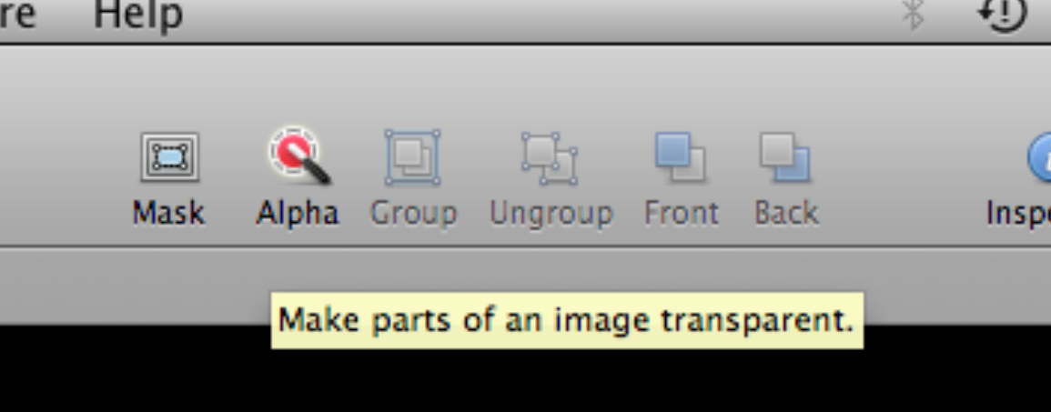
Using the Alpha Tool in Keynote, removing backgrounds can take seconds.


Keynotes Alpha tool.

  • Launch Keynote and select the black - blank template.
  • Command-a to select all of the objects on the page then delete.
  • Drag the image from your Finder onto the blank slide.
  • In my example I have a picture of Paris Hilton, this image will work perfectly due to the simple background.

  • With the picture enabled click once on the Alpha tool.
  • Move your cursor onto the blue background, click once, hold the click and expand your selection.

  • You’ll notice as you increase the diameter of the circle the blue that features in the picture is made transparent. As you drag, the selection grows to include the neighbouring area that uses similar colours.
  • So now that you have added a transparent background how can you get the picture out of Keynote and into Photoshop? Just select the picture once and press command-C.
  • Command C copies the picture including the transparent area. Now you can flick over to Photoshop create a new layer and press command-V.

  • Try removing more than just the background and some of the effects can be very inspiring.

Hopefully you are already thinking of ways to utilise this method, for quick mock ups or short deadlines this technique has saved the day many times for me.


Keynote inspiration! Animated lines

In this Keynote tutorial learn a nice tip to animate your lines as if they were drawing themselves !!! ;)We always try to encourage our students to think 'outside the box' and this video shows how layering objects can create a very cool effect. And remember this effect is not standard in Keynote

[youtube http://www.youtube.com/watch?v=sBbQc164I3U]